This version of the Speechly documentation is no longer actively maintained. For up-to-date documentation, see the latest version.
Styling the components
Voice form components can be styled with standard CSS. There are ready-made themes with overrideable CSS variables.
Themes
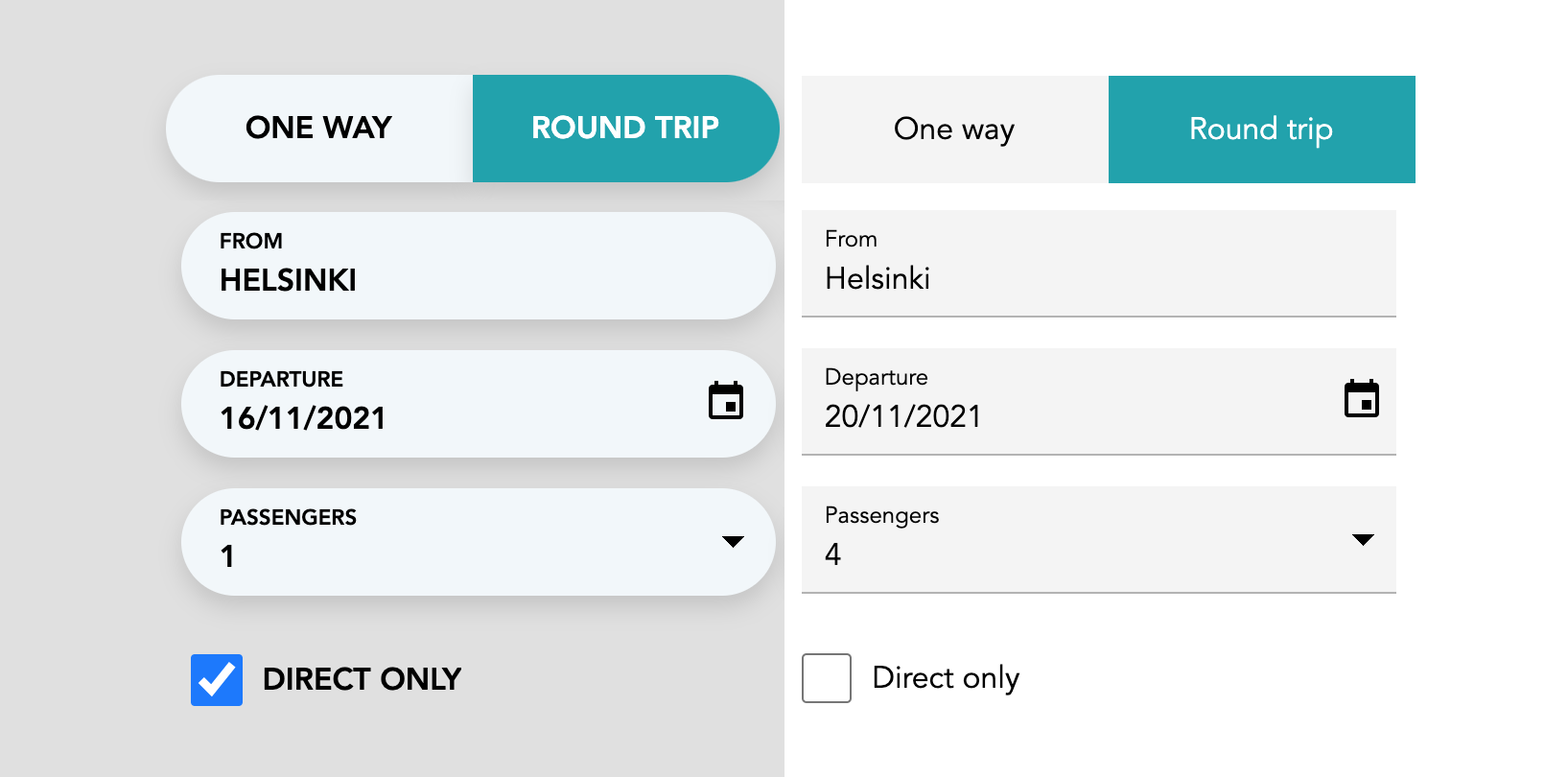
Preview of components dressed in capsule and mui themes. To enable one of the built-in themes, include the one of the css files.
// Enable Material UI inspired theme
import '@speechly/react-voice-forms/css/theme/mui.css'

// OR...

// Enable Capsule theme with round widget ends
import '@speechly/react-voice-forms/css/theme/capsule.css'
Customization
Typography
Set typography for the input elements to define custom typography:
/* app.css */
select, button, input, label {
  font-family: Helvetica, Arial, sans-serif;
  font-weight: regular;
  line-height: 120%;
}

select, input, button {
  font-size: 1.0rem;
}
CSS variables
Some properties of the themes are exposed as css variables. If you override them, be sure to include your css file after the themes.
/* app.css */
body {
  --color-input-bg: #f2f7fa;
  --color-input-active-bg: #00a2ad;
  --color-input-active-text: #ffffff;
  --dropdown-handle-size: 6px;
  --dropdown-handle-right-margin: 1rem;
  --widget-shadow: 0px 6px 12px 0px #00000020;
}
Further customization
To further tweak the themes, grab the css from npm package and make a copy in your project folder.
Last updated by Mathias Lindholm on January 26, 2022 at 11:48 +0200
Found an error on our documentation? Please file an issue or make a pull request